Polyglot programming using Jenkins

jenkins Facility for languages develops when one does not squander existing opportunities to code. That is what I think.

Jenkins, the CI enabler supports a few languages like Python and Groovy. The Python package I used to make the Rest API calls is ‘Python Jenkins’.It is interesting to note that run_script executes Groovy code.

I didn’t test it exactly when the Unix server runs out of disk space but assumed the text from the console output will match.Moreover the encryption routine works as expected but the decryption function doesn’t work. It seems that since I call the Rest API there could be a encryption/decryption key mismatch.


'''
Created on Oct 12, 2016

@author: Mohan Radhakrishnan

This python module gets the console output of the latest
build and if the text 'No space left on device' is found in
the output it sends a mail.
I've taken liberties with the 'functional paradigm'

'''
import smtplib
import jenkins
import os
def main():

overrideenvironmentvariables()

server = jenkins.Jenkins('http://localhost:8080', username='Mohan', password='Welcome1')

notifydisaster(server)

'''
Notify
'''
def notifydisaster( server ):
print( getconsoleoutput(server) )
name,buildnumber,consoleoutput = getconsoleoutput(server)
if (consoleoutput.find("Caused by: java.io.IOException: No space left on device") != -1):
print("Caused by: java.io.IOException: No space left on device")
sendmail( name,buildnumber )

'''
Notify
Password Encryption/decryption code has to be tested and used
'''
def sendmail(name,buildnumber):
smtp = smtplib.SMTP('smtp.gmail.com', 587)
smtp.ehlo()
smtp.starttls()
smtp.login("x.y@z.com","Password")
smtp.sendmail('x.y@z.com', 'x.y@z.com', 'Subject: No space left on device\n \
Job ' + name + ' Build ' + str(buildnumber) + ' fails due to lack of disk space')

'''
Get the console output of the particular
Job's build
'''
def getconsoleoutput(server):
information = getJobName(server)
if information:
return information[ 0 ]['name'] ,getlastjobDetails(server),server.get_build_console_output(information[ 0 ]['name'], getlastjobDetails(server))

'''
Get Job and other details
and filter the Job we are interested in
'''
def getJobName(server):
jobs = server.get_all_jobs(0)
filtercriterion = ['CITestPipeline']

return list(filter( lambda d: d['fullname'] in filtercriterion, jobs))

'''
Get Job and other details
Return '0' as the build number assuming
it signifies that there is no such build number
'''

def getlastjobDetails(server):
information = getJobName(server)
if information:
last_build_number = server.get_job_info(information[ 0 ]['name'])['lastCompletedBuild']['number']
return last_build_number
else:
return 0

'''
Attempt here to encrypt Passwords using Jenkins' key
Not tested properly
'''
def encrypt(server ):
value = server.run_script("""
secret = hudson.util.Secret.fromString("Password")
println secret.getEncryptedValue()
println secret.getPlainText()
""")
print (value)

def decrypt(server ):
decryptedvalue = server.run_script("""
secret = hudson.util.Secret.fromString("aiJREkuBjWHX9UWIyhEzwnnAJReuZnQVEtUr0KgvXKg")
println hudson.util.Secret.toString(secret)
""")
print (decryptedvalue)
return decryptedvalue
'''
Override this proxy setting as we don't
need it and it causes an error.
'''
def overrideenvironmentvariables():
os.environ["HTTP_PROXY"] = ''

if __name__=="__main__":
main()
Notes about Machine Learning fundamentals

I have decided to try a different tack in this post. Gradually as I learn some basic ideas about statistics and Machine Learning I will update this post with code, graphs or procedures used to configure tools. So in a few weeks I will have charted a simple course through the basic Machine Learning terrain. I hope. But these are just basic ideas to prepare oneself to read a more advanced math text.

To be updated …   I will add more details in subsequent posts.

Tools

Anaconda based on Anaconda

GraphLab based on GraphLab

ipython based on ipython

The installation process was tortuous because I work in a corporate environment.

Install GraphLab Create with Command Line

The installation is based on dato’s instructions.

Step 1: Ensure Python 2.7.x

Anaconda with Python 2.x installation didn’t complete in my Windows 7 machine due to some access restriction. It couldn’t set this version of Python as the default.
So I installed Anaconda with Python 3.x. GraphLab works with only Python 2.x

In order to create a Python 2.7 environment the command used is

conda create -n dato-env python=2.7 anaconda

This was blocked by my Virus Scanner and I had to coax our security team to update my policy settings to allow this.

Traceback (most recent call last):
File “D:\Continuum\Anaconda3.4\Scripts\conda-script.py”, line 4, in <module>
sys.exit(main())
File “D:\Continuum\Anaconda3.4\lib\site-packages\conda\cli\main.py”, line 202,
in main
args_func(args, p)
File “D:\Continuum\Anaconda3.4\lib\site-packages\conda\cli\main.py”, line 207,
in args_func
args.func(args, p)
File “D:\Continuum\Anaconda3.4\lib\site-packages\conda\cli\main_create.py”, li
ne 50, in execute
install.install(args, parser, ‘create’)
File “D:\Continuum\Anaconda3.4\lib\site-packages\conda\cli\install.py”, line 4
20, in install
plan.execute_actions(actions, index, verbose=not args.quiet)
File “D:\Continuum\Anaconda3.4\lib\site-packages\conda\plan.py”, line 502, in
execute_actions
inst.execute_instructions(plan, index, verbose)
File “D:\Continuum\Anaconda3.4\lib\site-packages\conda\instructions.py”, line
140, in execute_instructions
cmd(state, arg)
File “D:\Continuum\Anaconda3.4\lib\site-packages\conda\instructions.py”, line
55, in EXTRACT_CMD
install.extract(config.pkgs_dirs[0], arg)
File “D:\Continuum\Anaconda3.4\lib\site-packages\conda\install.py”, line 448,
in extract
t.extractall(path=path)
File “D:\Continuum\Anaconda3.4\lib\tarfile.py”, line 1980, in extractall
self.extract(tarinfo, path, set_attrs=not tarinfo.isdir())
File “D:\Continuum\Anaconda3.4\lib\tarfile.py”, line 2019, in extract
set_attrs=set_attrs)
File “D:\Continuum\Anaconda3.4\lib\tarfile.py”, line 2088, in _extract_member
self.makefile(tarinfo, targetpath)
File “D:\Continuum\Anaconda3.4\lib\tarfile.py”, line 2128, in makefile
with bltn_open(targetpath, “wb”) as target:
PermissionError: [Errno 13] Permission denied: ‘D:\\Continuum\\Anaconda3.4\\pkgs
\\python-2.7.11-4\\Lib\\pdb.doc’

The last line shown above is what I presume was blocked by the Virus scanner. When the logs were shown to the security team who updated the scanner rules.

Learning some of these topics may be difficult if we don’t read a more advanced book. So I am constrained by the lack of deep knowledge of a related math subject.

But a question like this one must be simple. Right ?

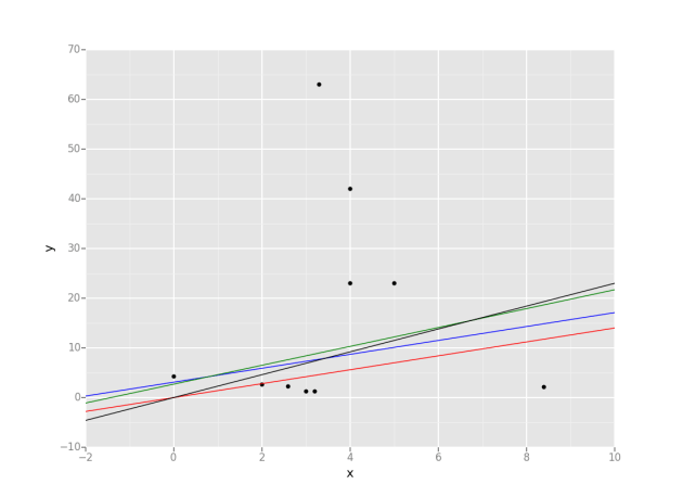
Identify which model performs better when you have the intercept, slope and Residual Sum of squares.

No data point is given.One can plot the lines when their intercepts and slopes are known but I don’t know how that helps.

Plot some lines when we know their intercepts and slopes. Data points are random though and are irrevelant at this time.
from ggplot import *
import pandas as pd
data = {'x': [0, 2, 3, 4, 5, 4, 3.2, 3.3, 2.6, 8.4],
'y': [4.2, 2.6, 1.2, 23, 23, 42, 1.2, 63, 2.3, 2.1],
}
df = pd.DataFrame(data)
g = ggplot(df, aes(x='x', y='y')) + \
geom_point() + \
geom_abline(intercept=0, slope=1.4, colour=&amp;quot;red&amp;quot;) \
+ geom_abline(intercept=3.1, slope=1.4, colour=&amp;quot;blue&amp;quot;) \
+ geom_abline(intercept=2.7, slope=1.9, colour=&amp;quot;green&amp;quot;) \
+ geom_abline(intercept=0, slope=2.3, colour=&amp;quot;black&amp;quot;)
print(g)


Q2

Gradient Descent

I ported the Gradient Descent code from Octave to Python. The base Octave code is the one from Andrew Ng’s Machine Learning MOOC.

I mistakenly believed that the Octave code for matrix multiplication will directly translate in Python.

The matrices are these.
Screen Shot 2015-10-25 at 9.27.09 pm

But the Octave code is this

Octave code

  theta = theta - ( (  alpha * ( (( theta' * X' )' - y)' * X ))/length(y) )'

and the Python code is this.

Python

def gradientDescent( X,
                     y,
                     theta,
                     alpha = 0.01,
                     num_iters = 1500):

    r,c = X.shape
    
    for iter in range( 1, num_iters ):
        theta = theta - ( ( alpha * np.dot( X.T, ( np.dot( X , theta ).T - np.asarray(y) ).T ) ) / r )
    return theta

This line is not a direct transalation.

        theta = theta - ( ( alpha * np.dot( X.T, ( np.dot( X , theta ).T - np.asarray(y) ).T ) ) / r )

But only the above Python code gives me the correct theta that matches the value given by the Octave code.

Screen Shot 2015-10-25 at 9.32.53 pm

Linear Regression

gradientdescent

But the gradient descent also does not give me the correct value after a certain number of iterations. But the cost value is similar.

Gradient Descent from Octave Code that converges

Octave-Contour

Minimization of cost

Initial cost is 640.125590
J = 656.25
Initial cost is 656.250475
J = 672.58
Initial cost is 672.583001
J = 689.12
Initial cost is 689.123170
J = 705.87
Initial cost is 705.870980
J = 722.83
Initial cost is 722.826433
J = 739.99
Initial cost is 739.989527

Gradient Descent from my Python Code that does not converge to the optimal value

gradientdescent1

Minimization of cost

635.81837438
651.963633303
668.316534159
684.877076945
701.645261664
718.621088313
735.804556895

Principal Component Analysis

This is about what I think I understood about Principal Component Analysis. I will update this blog post later.

The code is in github and it works but I think the eigen values could be wrong. I have to test it further.

These are the two main functions.


    """Compute the covariance matrix for a given dataset.
    """
def estimateCovariance( data ):
    print data
    mean = getmean( data )
    print mean
    dataZeroMean = map(lambda x : x - mean, data )
    print dataZeroMean
    covar = map( lambda x : np.outer(x,x) , dataZeroMean )
    print getmean( covar ) 
    return getmean( covar )

    """Computes the top `k` principal components, corresponding scores, and all eigenvalues.
    """
def pca(data, k=2):
    
    d = estimateCovariance(  data )
    
    eigVals, eigVecs = eigh(d)

    validate( eigVals, eigVecs )
    inds = np.argsort(eigVals)[::-1]
    topComponent = eigVecs[:,inds[:k]]
    print '\nTop Component: \n{0}'.format(topComponent)
    
    correlatedDataScores = map(lambda x : np.dot( x ,topComponent), data )
    print ('\nScores : \n{0}'
       .format('\n'.join(map(str, correlatedDataScores))))
    print '\n eigenvalues: \n{0}'.format(eigVals[inds])
    return topComponent,correlatedDataScores,eigVals[inds]

Aesthetics of Matplotlib graphs

matplotlib
The graph shown in my earlier postis not clear and it looks wrong. I have improved it to some extent using this code. Matplotlib has many features more powerful than what I used earlier. I have commented the code used to annotate and display the actual points in the graph. I couldn’t properly draw the tick marks so that the red graph is clearly shown because the data range wasn’t easy to work with. There should be some feature that I still have not explored.


import pandas as pd
import matplotlib.pyplot as plt
import matplotlib.dates as mdates
import numpy as np

def main():
    gclog = pd.DataFrame(columns=['SecondsSinceLaunch',
                                   'BeforeSize',
                                   'AfterSize',
                                   'TotalSize',
                                   'RealTime'])
    with open("D:\\performance\\data.txt", "r") as f:
        for line in f:
            strippeddata = line.split()
            gclog = gclog.append(pd.DataFrame( [dict(SecondsSinceLaunch=strippeddata[0],
                                                     BeforeSize=strippeddata[1],
                                                     AfterSize=strippeddata[2],
                                                     TotalSize=strippeddata[3],
                                                     RealTime=strippeddata[4])] ),
                                               ignore_index=True)
    print gclog
    #gclog.time = pd.to_datetime(gclog['SecondsSinceLaunch'], format='%Y-%m-%dT%H:%M:%S.%f')
    gclog = gclog.convert_objects(convert_numeric=True)
    fig, ax = plt.subplots(figsize=(17, 14), facecolor='white', edgecolor='white')
    ax.axes.tick_params(labelcolor='darkblue', labelsize='10')
    for axis, ticks in [(ax.get_xaxis(), np.arange(10, 8470, 100) ), (ax.get_yaxis(), np.arange(10, 9125, 300))]:
        axis.set_ticks_position('none')
        axis.set_ticks(ticks)
        axis.label.set_color('#999999')
        if False: axis.set_ticklabels([])
    plt.grid(color='#999999', linewidth=1.0, linestyle='-')
    plt.xticks(rotation=70)
    plt.gcf().subplots_adjust(bottom=0.15)
    map(lambda position: ax.spines[position].set_visible(False), ['bottom', 'top', 'left', 'right'])
    ax.set_xlabel(r'AfterSize'), ax.set_ylabel(r'TotalSize')
    ax.set_xlim(10, 8470, 100), ax.set_ylim(10, 9125, 300)    
    plt.plot(sorted(gclog.AfterSize),gclog.TotalSize,c="red")
#     for i,j in zip(sorted(gclog.AfterSize),gclog.TotalSize):
#         ax.annotate('(' + str(i) + ',' + str(j) + ')',xy=(i, j))
    
    plt.show()
if __name__=="__main__":
    main()

figure_1

In fact after finishing the Principal Component Analysis section of a Machine Learning course I took recently I realized beautiful 3D graphs can be drawn.

cube

Parsing HTML using BeautifulSoup

This Python code that parses HTML seems to truncate the tags when I print it. I am attempting to check for the presence of the ID attribute in the tags. The code just iterates over all tags and it does not specifically look for a HTML control. It just matches the opening and closing tag arbitratrily. I am still working on it and will update it.

D:\Python Data Analytics\view.html
   No                                                Tag
0   1  <div class="panel-collapse collapse" id="activ...
1   1  <select class="selectpicker " id="condition1...
2   1  <select class="selectpicker " id="condition2...
3   1  <select class="selectpicker " id="condition3...
4   1  <select class="selectpicker " id="condition4...
5   1  <select class="selectpicker " id="condition5...
6   1  <input class="btn xbtn-primary save" id="ApS...
7   1  <input class="btn btn-link" id="Cancel" name...
from bs4 import BeautifulSoup as bs
import sys
import os
import pandas as pd
import fnmatch

class Parse:
 
    def __init__(self):
        self.parse()


    def parse(self):
        
        pd.options.display.max_colwidth = 0
        try:
            path = "D:\\Python Data Analytics\\"
            
            f = open('D:\python\\report.html','w')

 
             #Pattern to be matched
            includes = ['*.html']
        
            for root, subFolders, files in os.walk(path):
                 for extensions in includes:
                     
                    for infile in fnmatch.filter(files, extensions):
                            soup = bs(open( path + infile, "r").read())
                                        
                            data = soup.findAll(True,{'id':True})
                            
                            df = pd.DataFrame(columns=[
                                                       'ID',
                                                       'Tag'])

                            idattributes = []
                            duplicates = [] 
                            
                            for attribute in data:
                                idTag = attribute.find('id')
                                att = attribute.attrs
                                idattributes.append(att['id'])
                                df = df.append(pd.DataFrame( [dict(
                                                                   ID=att['id'],
                                                                   Tag=attribute)] ),
                                                                   ignore_index=True)
                            s = set()
                            duplicates = set(x for x in idattributes if x in s or s.add(x))  
                                                              
                            data1 = soup.findAll(attrs={'id': None})
                            df1 = pd.DataFrame(columns=[
                                                       
                                                       'Tag'])
            
                            missingid = {} 
                            count = 0
                            for attribute in data1:
                                    missingid.update({count: attribute})
                                    df1 = df1.append(pd.DataFrame( [dict(
                                                                   Tag=attribute)] ),
                                                                   ignore_index=True)
                                    count = count + 1
                                    
                            df2 = pd.DataFrame(missingid.items())
                            html5report = df
                            print df2
                            html5report1 = df2
                            
                            table = ""
                            table += '<table>'
                            for element in duplicates:
                                table += '  <tr>'
                                table += '    <td>' + element + '</td>'
                                table += '  </tr>'
                            table += '</table>'
                            
                            html5report1 = html5report1.to_html().replace('<table border="1" class="dataframe">','<table class="table table-striped">')
                            html5report = html5report.to_html().replace('<table border="1" class="dataframe">','<table class="table table-striped">')
                            htmlreporter = '''
            							<html>
                							<head>
                    						<link rel="stylesheet" href="https://maxcdn.bootstrapcdn.com/bootstrap/3.3.1/css/bootstrap.min.css">
                    						<style>body{ margin:0 100; background:whitesmoke; }</style>
                							</head>
                                            <body>
                                            <h1>HTML 5 Report</h1>
                                            <h2>''' + infile + '''</h2>
            
                                            <h3>Tags with ID present</h3>
                   								''' + html5report + '''
                                            <h3>Tags with ID not present</h3>
                                                ''' + html5report1 + '''
                                            <h3>Possible Duplicates</h3>
                                                ''' + table + '''
                							</body>
            				</html>'''
                            f.write(htmlreporter)
            f.close()    
                            
        except IOError as e:
            print "I/O error({0}): {1}".format(e.errno, e.strerror)
        except Exception, err:
            print "Unexpected error:", sys.exc_info()[0]
 

if __name__ == '__main__':
    instance = Parse()

Pandas and matplotlib

matplotlibI have used R Data Frames and they were very versatile and compared to that the pandas Data Frames seem slightly harder to get right. But I am after the excellent support for Machine Learning and data analytics that scikit provides.

This graph is simple and I usually parse Java GC logs to practise. I plan to parse the Java G1 GC log to get my hands dirty by using pandas Data Frames.

  AfterSize BeforeSize RealTime       SecondsSinceLaunch TotalSize
0        20      3.109     9216  2014-05-13T13:24:35.091      5029
1      9125      3.459     9216  2014-05-13T13:24:35.440      6077
2        25      5.599     9216  2014-05-13T13:24:37.581      8470
3        44     10.704     9216  2014-05-13T13:24:42.686        15
4        51     16.958     9216  2014-05-13T13:24:48.941        20
5        92     24.066     9216  2014-05-13T13:24:56.049        26
6       602     62.383     9216  2014-05-13T13:25:34.368        68
import pandas as pd
import matplotlib.pyplot as plt
import matplotlib.dates as mdates

def main():
    gclog = pd.DataFrame(columns=['SecondsSinceLaunch',
                                   'BeforeSize',
                                   'AfterSize',
                                   'TotalSize',
                                   'RealTime'])
    with open("D:\\performance\\data.txt", "r") as f:
        for line in f:
            strippeddata = line.split()
            gclog = gclog.append(pd.DataFrame( [dict(SecondsSinceLaunch=strippeddata[0],
                                                     BeforeSize=strippeddata[1],
                                                     AfterSize=strippeddata[2],
                                                     TotalSize=strippeddata[3],
                                                     RealTime=strippeddata[4])] ),
                                               ignore_index=True)
    print gclog
    #gclog.time = pd.to_datetime(gclog['SecondsSinceLaunch'], format='%Y-%m-%dT%H:%M:%S.%f')
    gclog = gclog.convert_objects(convert_numeric=True)
    plt.plot(gclog.TotalSize, gclog.AfterSize)
    plt.show()
if __name__=="__main__":
    main()

matplotlib

Update :

The graph shown above is not clear and it looks wrong. I have improved it to some extent using this code. Matplotlib has many features more powerful than what I used earlier. I have commented the code used to annotate and display the actual points in the graph. I couldn’t properly draw the tick marks so that the red graph is clearly shown because the data range wasn’t easy to work with. There should be some feature that I still have not explored.


import pandas as pd
import matplotlib.pyplot as plt
import matplotlib.dates as mdates
import numpy as np

def main():
    gclog = pd.DataFrame(columns=['SecondsSinceLaunch',
                                   'BeforeSize',
                                   'AfterSize',
                                   'TotalSize',
                                   'RealTime'])
    with open("D:\\performance\\data.txt", "r") as f:
        for line in f:
            strippeddata = line.split()
            gclog = gclog.append(pd.DataFrame( [dict(SecondsSinceLaunch=strippeddata[0],
                                                     BeforeSize=strippeddata[1],
                                                     AfterSize=strippeddata[2],
                                                     TotalSize=strippeddata[3],
                                                     RealTime=strippeddata[4])] ),
                                               ignore_index=True)
    print gclog
    #gclog.time = pd.to_datetime(gclog['SecondsSinceLaunch'], format='%Y-%m-%dT%H:%M:%S.%f')
    gclog = gclog.convert_objects(convert_numeric=True)
    fig, ax = plt.subplots(figsize=(17, 14), facecolor='white', edgecolor='white')
    ax.axes.tick_params(labelcolor='darkblue', labelsize='10')
    for axis, ticks in [(ax.get_xaxis(), np.arange(10, 8470, 100) ), (ax.get_yaxis(), np.arange(10, 9125, 300))]:
        axis.set_ticks_position('none')
        axis.set_ticks(ticks)
        axis.label.set_color('#999999')
        if False: axis.set_ticklabels([])
    plt.grid(color='#999999', linewidth=1.0, linestyle='-')
    plt.xticks(rotation=70)
    plt.gcf().subplots_adjust(bottom=0.15)
    map(lambda position: ax.spines[position].set_visible(False), ['bottom', 'top', 'left', 'right'])
    ax.set_xlabel(r'AfterSize'), ax.set_ylabel(r'TotalSize')
    ax.set_xlim(10, 8470, 100), ax.set_ylim(10, 9125, 300)    
    plt.plot(sorted(gclog.AfterSize),gclog.TotalSize,c="red")
#     for i,j in zip(sorted(gclog.AfterSize),gclog.TotalSize):
#         ax.annotate('(' + str(i) + ',' + str(j) + ')',xy=(i, j))
    
    plt.show()
if __name__=="__main__":
    main()

figure_1

Data visualization using D3.js and Flask

flask

I set about visualizing my twitter stream data using Apache Storm. The code uses Storm to stream tweets to Redis. Python Flask accesses the keys and values from Redis and streams to the browser. D3.js renders the view. In this post I am showing sample code that uses D3.js and Python Flask. JSON data is passed from the Flask web server to the D3.js library. The code doesn’t stream tweets now but as we know tweets are received in JSON too.

This code also uses other libraries like numpy and pandas. It is also possible to use Machine Learning algorithms from scikit.

I will endeavor to post Python code that uses Redis and Apache Storm code that uses Twitter4J and OAuth later. The idea is to visualize streaming tweets from the Twitter garden hose in real-time in the browser. The star of this show is actually Apache Storm and Redis. More about that later.

All of this is made possible by the Vagrant box with Ubuntu. But I had to execute sudo apt-get update, upgrade gcc, execute sudo apt-get install python2.7-dev and then execute sudo pip install pandas

HTML


<html>
<head>
  <meta charset="UTF-8">
  <title>Page Title</title>
  <!-- Latest compiled and minified CSS -->
  <link rel="stylesheet" href="//netdna.bootstrapcdn.com/bootstrap/3.1.1/css/bootstrap.min.css">
  <!-- Optional theme -->
  <link rel="stylesheet" href="//netdna.bootstrapcdn.com/bootstrap/3.1.1/css/bootstrap-theme.min.css">
  <!-- APP js -->
  <script src="//ajax.googleapis.com/ajax/libs/jquery/1.11.1/jquery.min.js"></script>
  <!-- add d3 from web -->
  <script src="http://d3js.org/d3.v3.min.js" charset="utf-8"></script>
  <style>
  path {
    stroke: steelblue;
    stroke-width: 1;
    fill: none;
  }
  .axis {
    shape-rendering: crispEdges;
  }

  .x.axis line {
    stroke: lightgrey;
  }

  .x.axis .minor {
    stroke-opacity: .5;
  }

  .x.axis path {
    display: none;
  }

  .y.axis line, .y.axis path {
    fill: none;
    stroke: #000;
  }

  </style>
</head>
<body>
  <div id="graph" class="aGraph" style="position:absolute;top:20pxleft:400; float:left"></div>
</body>
<script>

                    var margin = {top: 30, right: 20, bottom: 70, left: 50},
                    width = 600 - margin.left - margin.right,
                    height = 270 - margin.top - margin.bottom;


                    //Create the Scale we will use for the Axis
                    var axisScale = d3.scale.linear()
                                             .domain([0, 500])
                                             .range([0, width]);


                    var yaxisScale = d3.scale.linear()
                    .domain([0, 5])
                    .range([ height,0]);

                    var xAxis = d3.svg.axis()
                    .scale(axisScale)
                    .orient("bottom");

                    var yAxis = d3.svg.axis()
                    .scale(yaxisScale)
                    .orient("left");

                    var svgContainer = d3.select("body").
                    append("svg")
                    .attr("width", width + margin.left + margin.right)
                    .attr("height", height + margin.top + margin.bottom)
                    .append("g")
                    .attr("transform", "translate(" + margin.left + "," + margin.top + ")");

                    svgContainer.append("g")
                    .attr("class", "x axis")
                    .attr("transform", "translate(0," + height + ")")
                    .call(xAxis);

                    svgContainer.append("g")
                    .attr("class", "y axis")
                    .call(yAxis);

                    // create a line
                    var line = d3.svg.line()
                    .x(function(d,i) {
                      console.log(d.x);
                      return axisScale(d.x);
                    })
                    .y(function(d,i) {
                      console.log(d.y);
                      return yaxisScale(d.y);
                    })
                    var data = {{ data|safe }}
                    svgContainer.append("svg:path").attr("class", "line").attr("d", line(data));

</script>

</html>


Python


from flask import Flask, render_template, Response,make_response

import redis
import random
import json
import pandas
import numpy as np

df = pandas.DataFrame({
    "x" : [11,28,388,400,420],
    "y" : np.random.rand(5)
})

d = [
    dict([
        (colname, row[i])
        for i,colname in enumerate(df.columns)
    ])
    for row in df.values
]
app = Flask(__name__)

@app.route('/streamdata')
def event_stream():
    make_response(d.to_json())

@app.route('/stream')
def show_basic():
    x = random.randint(0,101)
    y = random.randint(0,101)
    print json.dumps(d)
    return render_template("redisd3.html",data=json.dumps(d))


if __name__ == '__main__':
    app.run(threaded=True,
    host='0.0.0.0'
)

Line Graph

d3graph

Matrix multiplication

This is simplified code that multiplies two matrices – a and b – using data stored in a file.

["a", 0, 0, 63]
["a", 0, 1, 45]
["a", 0, 2, 93]
["a", 0, 3, 32]
["a", 0, 4, 49]
["a", 1, 0, 33]
["a", 1, 3, 26]
["a", 1, 4, 95]
["a", 2, 0, 25]
["a", 2, 1, 11]
["a", 2, 3, 60]
["a", 2, 4, 89]
["a", 3, 0, 24]
["a", 3, 1, 79]
["a", 3, 2, 24]
["a", 3, 3, 47]
["a", 3, 4, 18]
["a", 4, 0, 7]
["a", 4, 1, 98]
["a", 4, 2, 96]
["a", 4, 3, 27]
["b", 0, 0, 63]
["b", 0, 1, 18]
["b", 0, 2, 89]
["b", 0, 3, 28]
["b", 0, 4, 39]
["b", 1, 0, 59]
["b", 1, 1, 76]
["b", 1, 2, 34]
["b", 1, 3, 12]
["b", 1, 4, 6]
["b", 2, 0, 30]
["b", 2, 1, 52]
["b", 2, 2, 49]
["b", 2, 3, 3]
["b", 2, 4, 95]
["b", 3, 0, 77]
["b", 3, 1, 75]
["b", 3, 2, 85]
["b", 4, 1, 46]
["b", 4, 2, 33]
["b", 4, 3, 69]
["b", 4, 4, 88]

I loaded this data in a dict so that the keys are the tuples(row,column).

      for x in sorted(matrixa.items()):
            print x

((0, 0), 63)
((0, 1), 45)
((0, 2), 93)
((0, 3), 32)
((0, 4), 49)
((1, 0), 33)
((1, 3), 26)
((1, 4), 95)
((2, 0), 25)
((2, 1), 11)
((2, 3), 60)
((2, 4), 89)
((3, 0), 24)
((3, 1), 79)
((3, 2), 24)
((3, 3), 47)
((3, 4), 18)
((4, 0), 7)
((4, 1), 98)
((4, 2), 96)
((4, 3), 27)

It is a sparse matrix. So all the values may not be there. The code has to check that.

     l = []

      for i in range(0,5):
        for j in range(0,5):
            for k in range(0,5):
               if (i,k) in matrixa:
                   x = matrixa[(i,k)]
               else:
                   x = 0
               if (k,j) in matrixb:
                   y = matrixb[(k,j)]
               else:
                   y = 0
               z += x * y
            l.append([i,j,z])
            z = 0
     for i in l:
        print i

The result is this.

[0, 0, 11878]
[0, 1, 14044]
[0, 2, 16031]
[0, 3, 5964]
[0, 4, 15874]
[1, 0, 4081]
[1, 1, 6914]
[1, 2, 8282]
[1, 3, 7479]
[1, 4, 9647]
[2, 0, 6844]
[2, 1, 9880]
[2, 2, 10636]
[2, 3, 6973]
[2, 4, 8873]
[3, 0, 10512]
[3, 1, 12037]
[3, 2, 10587]
[3, 3, 2934]
[3, 4, 5274]
[4, 0, 11182]
[4, 1, 14591]
[4, 2, 10954]
[4, 3, 1660]
[4, 4, 9981]

Filter a Python dictionary

((u'Valjean', u'MmeDeR'), (u'MmeDeR', u'Valjean'))
((u'Valjean', u'Montparnasse'), (u'Montparnasse', u'Valjean'))
((u'Myriel', u'Count'), (u'Count', u'Myriel'))
((u'Valjean', u'Judge'), (u'Judge', u'Valjean'))
((u'Napoleon', u'Myriel'), (u'Myriel', u'Napoleon'))
((u'Myriel', u'Valjean'), (u'Valjean', u'Myriel'))
((u'Champtercier', u'Myriel'), (u'Myriel', u'Champtercier'))
((u'Myriel', u'OldMan'), (u'OldMan', u'Myriel'))
((u'Valjean', u'Woman1'), (u'Woman1', u'Valjean'))
((u'Valjean', u'Babet'), (u'Babet', u'Valjean'))
((u'MlleBaptistine', u'Valjean'), (u'Valjean', u'MlleBaptistine'))
((u'MmeMagloire', u'Myriel'), (u'Myriel', u'MmeMagloire'))
((u'Valjean', u'Labarre'), (u'Labarre', u'Valjean'))
((u'Valjean', u'Woman2'), (u'Woman2', u'Valjean'))
((u'Myriel', u'Geborand'), (u'Geborand', u'Myriel'))
((u'Valjean', u'Marguerite'), (u'Marguerite', u'Valjean'))
((u'MlleBaptistine', u'MmeMagloire'), (u'MmeMagloire', u'MlleBaptistine'))
((u'Valjean', u'Isabeau'), (u'Isabeau', u'Valjean'))
((u'Valjean', u'Simplice'), (u'Simplice', u'Valjean'))
((u'Valjean', u'Gillenormand'), (u'Gillenormand', u'Valjean'))
((u'Valjean', u'MlleGillenormand'), (u'MlleGillenormand', u'Valjean'))
((u'Myriel', u'Champtercier'), (u'Champtercier', u'Myriel'))
((u'Valjean', u'MmeMagloire'), (u'MmeMagloire', u'Valjean'))
((u'Valjean', u'Fantine'), (u'Fantine', u'Valjean'))
((u'MlleBaptistine', u'Myriel'), (u'Myriel', u'MlleBaptistine'))
((u'Valjean', u'Myriel'), (u'Myriel', u'Valjean'))
((u'Valjean', u'Cosette'), (u'Cosette', u'Valjean'))

I am used to the verbosity of Java. So Python is like a breath of fresh air.
But this Python code stumped me for the better part of two days.

I was trying to filter the keys in the dictionary shown above based on its own values. One of the examples is shown in a different color. So if the key matches a value then that dictionary row with that particular key should be removed. The row with the matching value is untouched.

It is literally one line of Python.

    for v in friends.iteritems():
        print v
    result = [k for k, v in friends.iteritems() if v not in friends.keys()]
    for v in result:
        print v