Distributed Training using TensorFlow Federated

This is a very simple example of using multiple GPUs using a Jupyter Notebook to train a model. Obviously this involves multiple machines or VMs or in this case multiple processes in a simple Compute instance. Multiple processes in a single VM make it easier to test.

GPUs seem to be a costly affair.

I connected using SSH and these are the details of the VM

======================================
Welcome to the Google Deep Learning VM
======================================

Version: tf2-gpu.2-8.m92
Based on: Debian GNU/Linux 10 (buster) (GNU/Linux 4.19.0-20-cloud-amd64 x86_64\n)

Resources:
 * Google Deep Learning Platform StackOverflow: https://stackoverflow.com/questions/tagged/google-dl-platform
 * Google Cloud Documentation: https://cloud.google.com/deep-learning-vm
 * Google Group: https://groups.google.com/forum/#!forum/google-dl-platform

To reinstall Nvidia driver (if needed) run:
sudo /opt/deeplearning/install-driver.sh
TensorFlow comes pre-installed with this image. To install TensorFlow binaries in a virtualenv (or conda env),
please use the binaries that are pre-built for this image. You can find the binaries at
/opt/deeplearning/binaries/tensorflow/
If you need to install a different version of Tensorflow manually, use the common Deep Learning image with the
right version of CUDA

Linux distributedtraining 4.19.0-20-cloud-amd64 #1 SMP Debian 4.19.235-1 (2022-03-17) x86_64

The programs included with the Debian GNU/Linux system are free software;
the exact distribution terms for each program are described in the
individual files in /usr/share/doc/*/copyright.

Debian GNU/Linux comes with ABSOLUTELY NO WARRANTY, to the extent
permitted by applicable law.


(base) root@distributedtraining:~# nvidia-smi
Wed May 25 04:59:48 2022       
+-----------------------------------------------------------------------------+
| NVIDIA-SMI 470.57.02    Driver Version: 470.57.02    CUDA Version: 11.4     |
|-------------------------------+----------------------+----------------------+
| GPU  Name        Persistence-M| Bus-Id        Disp.A | Volatile Uncorr. ECC |
| Fan  Temp  Perf  Pwr:Usage/Cap|         Memory-Usage | GPU-Util  Compute M. |
|                               |                      |               MIG M. |
|===============================+======================+======================|
|   0  Tesla T4            Off  | 00000000:00:04.0 Off |                    0 |
| N/A   64C    P0    29W /  70W |      0MiB / 15109MiB |      0%      Default |
|                               |                      |                  N/A |
+-------------------------------+----------------------+----------------------+
|   1  Tesla T4            Off  | 00000000:00:05.0 Off |                    0 |
| N/A   59C    P0    30W /  70W |      0MiB / 15109MiB |      0%      Default |
|                               |                      |                  N/A |
+-------------------------------+----------------------+----------------------+
                                                                               
+-----------------------------------------------------------------------------+
| Processes:                                                                  |
|  GPU   GI   CI        PID   Type   Process name                  GPU Memory |
|        ID   ID                                                   Usage      |
|=============================================================================|
|  No running processes found                                                 |
+-----------------------------------------------------------------------------+

Build Jupyter

Since my automatic build failed I built myself. Not sure why it should fail.

radhakrishnan_mohan@distributedtraining:~$ sudo -i
(base) root@distributedtraining:~# jupyter lab build --dev-build=False --minimize=False
[LabBuildApp] JupyterLab 3.2.9
[LabBuildApp] Building in /opt/conda/share/jupyter/lab
[LabBuildApp] Building jupyterlab assets (production, not minimized)
(base) root@distributedtraining:~# jupyter labextension list
JupyterLab v3.2.9
/opt/conda/share/jupyter/labextensions
        nbdime-jupyterlab v2.1.1 enabled OK
        jupyterlab-jupytext v1.3.8+dev enabled OK (python, jupytext)
        jupyterlab_pygments v0.2.2 enabled OK (python, jupyterlab_pygments)
        @jupyterlab/server-proxy v3.2.1 enabled OK
        @jupyterlab/git v0.37.1 enabled OK (python, jupyterlab-git)
        @jupyter-widgets/jupyterlab-manager v3.1.0 enabled OK (python, jupyterlab_widgets)

Other labextensions (built into JupyterLab)
   app dir: /opt/conda/share/jupyter/lab
        beatrix_jupyterlab v3.1.7 disabled OK
        jupyterlab-plotly v5.8.0 enabled OK
        plotlywidget v4.14.3 enabled OK
        tensorflow_model_analysis v0.34.1 enabled OK
        wit-widget v1.8.1 enabled OK
        xai_tabular_widget v0.1.0 enabled OK

Assign GPU device to worker

It seems that it is imperative to assign a particular GPU to a worker as we have 2 Tesla P4 GPUs and 2 workers. If we don’t then there is failure to allocate GPU memory adequately. This line of code does that.

os.environ['CUDA_VISIBLE_DEVICES']=str(index)

Sorry, something went wrong. Reload?
Sorry, we cannot display this file.
Sorry, this file is invalid so it cannot be displayed.

Pandas and matplotlib

matplotlibI have used R Data Frames and they were very versatile and compared to that the pandas Data Frames seem slightly harder to get right. But I am after the excellent support for Machine Learning and data analytics that scikit provides.

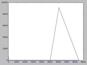
This graph is simple and I usually parse Java GC logs to practise. I plan to parse the Java G1 GC log to get my hands dirty by using pandas Data Frames.

  AfterSize BeforeSize RealTime       SecondsSinceLaunch TotalSize
0        20      3.109     9216  2014-05-13T13:24:35.091      5029
1      9125      3.459     9216  2014-05-13T13:24:35.440      6077
2        25      5.599     9216  2014-05-13T13:24:37.581      8470
3        44     10.704     9216  2014-05-13T13:24:42.686        15
4        51     16.958     9216  2014-05-13T13:24:48.941        20
5        92     24.066     9216  2014-05-13T13:24:56.049        26
6       602     62.383     9216  2014-05-13T13:25:34.368        68
import pandas as pd
import matplotlib.pyplot as plt
import matplotlib.dates as mdates

def main():
    gclog = pd.DataFrame(columns=['SecondsSinceLaunch',
                                   'BeforeSize',
                                   'AfterSize',
                                   'TotalSize',
                                   'RealTime'])
    with open("D:\\performance\\data.txt", "r") as f:
        for line in f:
            strippeddata = line.split()
            gclog = gclog.append(pd.DataFrame( [dict(SecondsSinceLaunch=strippeddata[0],
                                                     BeforeSize=strippeddata[1],
                                                     AfterSize=strippeddata[2],
                                                     TotalSize=strippeddata[3],
                                                     RealTime=strippeddata[4])] ),
                                               ignore_index=True)
    print gclog
    #gclog.time = pd.to_datetime(gclog['SecondsSinceLaunch'], format='%Y-%m-%dT%H:%M:%S.%f')
    gclog = gclog.convert_objects(convert_numeric=True)
    plt.plot(gclog.TotalSize, gclog.AfterSize)
    plt.show()
if __name__=="__main__":
    main()

matplotlib

Update :

The graph shown above is not clear and it looks wrong. I have improved it to some extent using this code. Matplotlib has many features more powerful than what I used earlier. I have commented the code used to annotate and display the actual points in the graph. I couldn’t properly draw the tick marks so that the red graph is clearly shown because the data range wasn’t easy to work with. There should be some feature that I still have not explored.


import pandas as pd
import matplotlib.pyplot as plt
import matplotlib.dates as mdates
import numpy as np

def main():
    gclog = pd.DataFrame(columns=['SecondsSinceLaunch',
                                   'BeforeSize',
                                   'AfterSize',
                                   'TotalSize',
                                   'RealTime'])
    with open("D:\\performance\\data.txt", "r") as f:
        for line in f:
            strippeddata = line.split()
            gclog = gclog.append(pd.DataFrame( [dict(SecondsSinceLaunch=strippeddata[0],
                                                     BeforeSize=strippeddata[1],
                                                     AfterSize=strippeddata[2],
                                                     TotalSize=strippeddata[3],
                                                     RealTime=strippeddata[4])] ),
                                               ignore_index=True)
    print gclog
    #gclog.time = pd.to_datetime(gclog['SecondsSinceLaunch'], format='%Y-%m-%dT%H:%M:%S.%f')
    gclog = gclog.convert_objects(convert_numeric=True)
    fig, ax = plt.subplots(figsize=(17, 14), facecolor='white', edgecolor='white')
    ax.axes.tick_params(labelcolor='darkblue', labelsize='10')
    for axis, ticks in [(ax.get_xaxis(), np.arange(10, 8470, 100) ), (ax.get_yaxis(), np.arange(10, 9125, 300))]:
        axis.set_ticks_position('none')
        axis.set_ticks(ticks)
        axis.label.set_color('#999999')
        if False: axis.set_ticklabels([])
    plt.grid(color='#999999', linewidth=1.0, linestyle='-')
    plt.xticks(rotation=70)
    plt.gcf().subplots_adjust(bottom=0.15)
    map(lambda position: ax.spines[position].set_visible(False), ['bottom', 'top', 'left', 'right'])
    ax.set_xlabel(r'AfterSize'), ax.set_ylabel(r'TotalSize')
    ax.set_xlim(10, 8470, 100), ax.set_ylim(10, 9125, 300)    
    plt.plot(sorted(gclog.AfterSize),gclog.TotalSize,c="red")
#     for i,j in zip(sorted(gclog.AfterSize),gclog.TotalSize):
#         ax.annotate('(' + str(i) + ',' + str(j) + ')',xy=(i, j))
    
    plt.show()
if __name__=="__main__":
    main()

figure_1

matplotlib

logo2

I wanted to generate the boxplot graphs in this DZone article using ‘R’. I think this is one of the best graphs I have seen. It shows data in a really useful manner that could help our Capacity Planners. I am quite proficient with basic ‘R’ data analysis and plots.

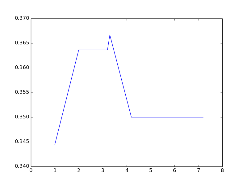
So I started to look at matplotlib,a powerful Python plotting library. So as a first step I coded this Python program using matplotlib.

  1. I am using PyDev plugin for eclipse.
  2. I am also using Enthought Canopy as by Python interpreter. This package has all the libraries I need.

    I strugged for some time to configure the Python packages so that Pydev can use them properly instead of the default Python in my Mac machine.

    All is well in the end. I have coded Python in the past but my skills are rudimentary but still this code was simple. It has many similarities to ‘R’.

    '''
    Sample
    '''
    import numpy as np
    import matplotlib
    import matplotlib.pyplot as plt
    
    x = []
    y = []
    
    data = [[ 6.2, 18, 0.3444444  ],
            [ 1.0,  11, 0.3636364 ],
            [ 2.0,  11, 0.3636364 ],
            [ 3.3,  9, 0.3666667  ],
            [ 4.2,  12, 0.3500000 ],
            [ 3.2,  12, 0.3500000 ],
            [ 5.2,  12, 0.3500000 ],
            [ 6.3,  12, 0.3500000 ],
            [ 7.2,  12, 0.3500000]]
    
    for list in data:
        for number in list[:1]:
            x.append(number)        
    
    for list in data:
        for number in list[2:3]:
            y.append(number)        
             
    x.sort()
    
    print(x)
    print(y)
    
    plt.xlim( (0, 8) )
    
    plt.plot(x,y)
    
    plt.show()
    

    figure_1