Plotting ‘time’ values

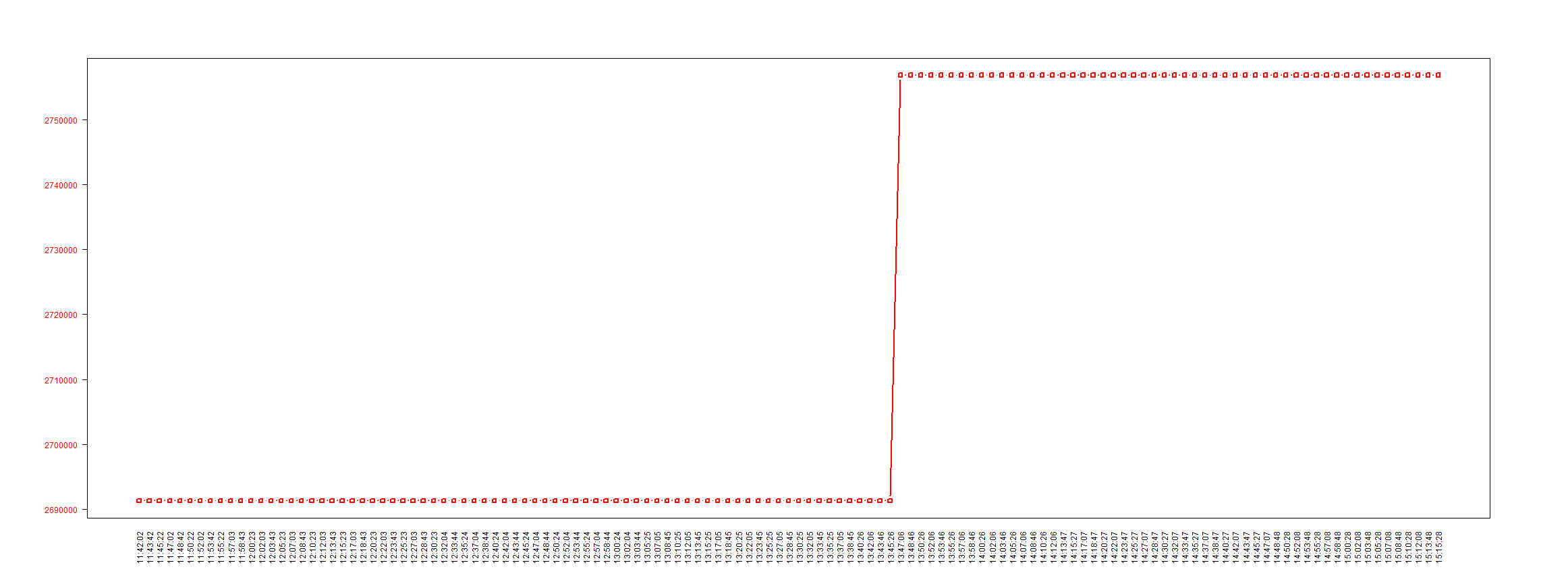
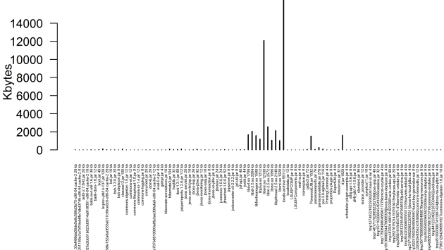
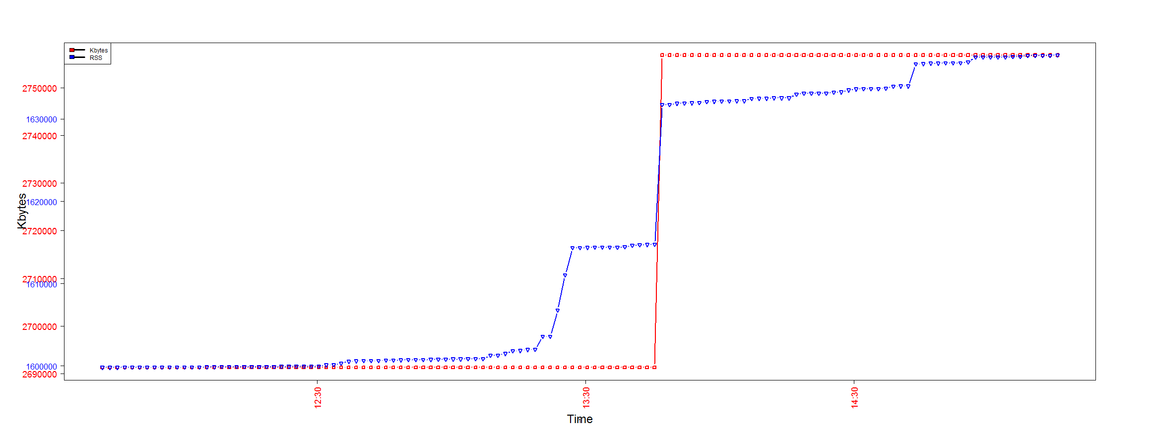
Data in ‘time’ format seems to need a different type of process to plot properly. This code uses strptime to get a proper graph. I have plotted two sets of data on the same plot. This is not visually appealing but serves the purpose. So here the linux ‘pmap’ ouput, ‘Kbytes’ and ‘RSS’ are both plotted against the same time values.

The y-axis label colours differentiate the graphs from one another.


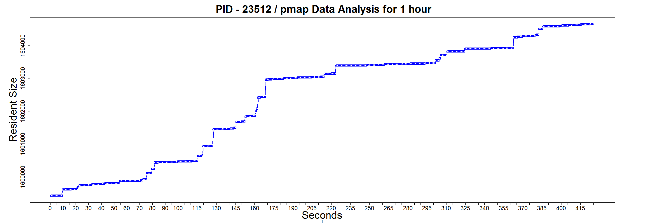
13:07:05 2691296 1600864 1583804
13:08:45 2691296 1601280 1584220
13:10:25 2691296 1601280 1584220
13:12:05 2691296 1601480 1584420
13:13:45 2691296 1601820 1584760
13:15:25 2691296 1601852 1584792
13:17:05 2691296 1601960 1584900
13:18:45 2691296 1601996 1584936
13:20:25 2691296 1603548 1586488


this.dir <- dirname(parent.frame(2)$ofile) 
setwd(this.dir)


data = read.table("D:\\Log analysis\\pmapdata-node1.1",header=F)
colnames(data) <- c("Time","Kbytes","RSS","Dirty Mode")


png(
"pmapanalysis4705.png",
width = 2324, height = 868)
par(mar=c(7, 9, 6, 8))

plot(strptime(data$Time,"%H:%M:%S"),data$Kbytes,pch=0,type="b",col = "red", col.axis="red", ylab="", xlab="",las=2,lwd=2.5,cex.axis=1.5)
title("",cex.main=3,xlab="Time", line=5.2,ylab="Kbytes", cex.lab=2,1)
par(new=T)
plot(strptime(data$Time,"%H:%M:%S"),data$RSS,col="blue",cex.axis=1.3,col.axis="blue",pch=6,type="b",xaxt="n",ylab="",xlab="",las=2,lwd=2.5)
legend("topleft", lty=c(1,1),lwd=c(3.5,3.5),c("Kbytes","RSS"), fill=c("red","blue"))
box()

dev.off()


pmapanalysis4705

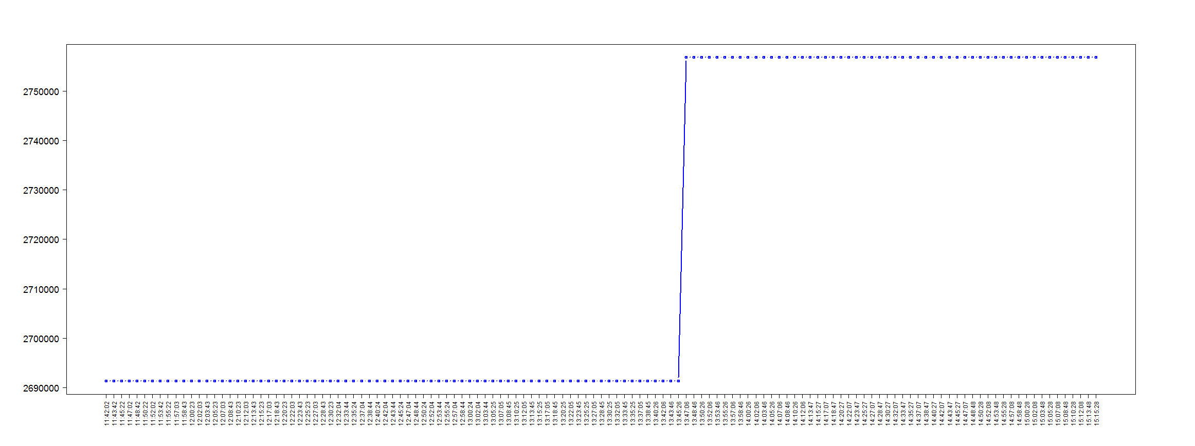
One problem with this graph is that very few time values are plotted on the x-axis. I don’t know the reason for this but when I asked the ‘R’ forum Jim Holtman suggested this code.


this.dir <- dirname(parent.frame(2)$ofile) 
setwd(this.dir)


data = read.table("D:\\Log analysis\\pmapdata-node1.1",header=F)
colnames(data) <- c("Time","Kbytes","RSS","Dirty Mode")


png(
"pmapanalysis4705.png",
width = 2324, height = 868)
par(mar=c(7, 9, 6, 8))

data$tod <- as.POSIXct(paste('2013-08-28', data$Time))
plot(data$tod,data$Kbytes,type="b",col = "blue", ylab="", xaxt = 'n', xlab="",las=2,lwd=2.5, lty=1,cex.axis=1.5)
# now plot you times
axis(1, at = data$tod, labels = data$Time, las = 2)

box()

dev.off()


pmapanalysis4705

Update : Suggestion from Jim Lemon to use ‘plotrix’

this.dir <- dirname(parent.frame(2)$ofile) 
setwd(this.dir) 


data = read.table("D:\\Log analysis\\pmapdata-node1.1",header=F)
colnames(data) <- c("Time","Kbytes","RSS","Dirty Mode")


png(
  "pmapanalysis4705.png",
   width = 2324, height = 868)
par(mar=c(7, 9, 6, 8))

plot(strptime(data$Time,"%H:%M:%S"),data$Kbytes,pch=0,
  type="b",col="red",col.axis="red", ylab="",
  xlab="",las=2,lwd=2.5,xaxt="n")
library(plotrix)
staxlab(at=as.numeric(strptime(data$Time,"%H:%M:%S")),
  labels=as.character(data$Time),nlines=3,srt=90)

box()

dev.off()

pmapanalysis4705

Further ‘pmap’ analysis

One of the linux administrators thought that the JVM is using all the memory in his linux server. So as a means of convincing him otherwise I plotted the ‘RSS’ column from ‘pmap’ output as a time series graph.

this.dir <- dirname(parent.frame(2)$ofile) 
setwd(this.dir) 


data = read.table("D:\\Log analysis\\pmapdata-node1.15979",header=F)
colnames(data) <- c("Kbytes","RSS","Dirty Mode")
rNo<-as.integer(rownames(data))
data<-cbind(data,rNo)

png(
  "pmapanalysis15979RSS.png",
   width = 2224, height = 768)
par(mar=c(5, 7, 4, 8) + 0.1)

plot(data$rNo,data$RSS,pch=0,type="b",col="blue",axes=FALSE,  ylab="", xlab="",las=2,lwd=2.5)
title(" PID - 15979 / pmap Data Analysis for 1 hour",cex.main=3,xlab="Seconds", ylab="Resident Size", cex.lab=3,1)

axis(side=1, at=seq(0, max(data$rNo), by=5), cex.axis=1.7)
axis(side=2, at=seq(0, max(data$RSS), by=10000), cex.axis=1.7)


box()

dev.off()


Graph of Resident Size of the JVM

Processing unix ”pmap” output of a JVM

Analysis of the output of

pmap

using R seemed to take forever. The functional programming style did not help much. But the code with comments is below.

I plan to use this code as part of a ‘nmon’ data analyzer. Code will be in github soon.


@ Set the current directory so that the graphs are generated there
this.dir <- dirname(parent.frame(2)$ofile) 
setwd(this.dir) 


#Split unix 'pmap' output. This line is like black magic to me at this time.
d <- do.call(rbind, lapply(strsplit(readLines("D:\\Log analysis\\Process Maps\\pmap_5900"), "\\s+"), function(fields) c(fields[1:10], paste(fields[-(1:10)], collapse = " "))))

#Now I am assigning some columns names
colnames(d) <- c("Address","Kbytes","RSS","Dirty Mode","Mapping","Test6","Test7","Test8","Test9","Test10","Test11")

#This section isolates and graphs mainly 'anon' memory sizes


#Aggregate and sum by type of memory allocation to get cumulative size for each type
Type2 <- setNames(aggregate(as.numeric(d[,"Kbytes"]), by=list(d[,"Test6"]),FUN=sum,na.rm=TRUE),c("AllocationType","Size"))

#I don't want this line. The extra braces in the original file have been added to the columns separately
Type2 <-subset(Type2, Type2$AllocationType != "[")

#Create data frame and cleanse
x<-data.frame(d[,7],d[,6],d[,2])
y<-subset(x, x[1] != "NA")
z<-data.frame(y[1],y[3])

png(
  "anonymous1.jpg",
  width     = 6.25,
  height    = 3.50,
  units     = "in",
  res       = 600,
)
par(mar=c(7,4,1,0))

colnames(z) <- c("AllocationType","Size")

# Split into rows of 100 each. This is not generic.
Type1Split<-split(z, sample(rep(1:3, 100)))
size<-data.frame(Type1Split[[1]]$Size)
colnames(size)<-c("Size")

#Plot the first set
barplot(as.numeric(levels(size$Size)[size$Size]),ylim=c(0,2000), names.arg=(paste(Type1Split[[1]]$AllocationType,Type1Split[[1]]$Size,"kb",sep=" ")),space=6, width=2, xlim = c(0, 1500), ylab="Kbytes",cex.names=0.3,las=2)

dev.off()

png(
  "anonymous2.png",
  width     = 6.25,
  height    = 3.50,
  units     = "in",
  res       = 600,
)
par(mar=c(7,4,1,0))

size<-data.frame(Type1Split[[2]]$Size)
colnames(size)<-c("Size")

#Plot the second set

barplot(as.numeric(levels(size$Size)[size$Size]),ylim=c(0,2000), names.arg=(paste(Type1Split[[2]]$AllocationType,Type1Split[[2]]$Size,"kb",sep=" ")),space=6, width=2, xlim = c(0, 1500), ylab="Kbytes",cex.names=0.3,las=2)

dev.off()

png(
  "anonymous3.png",
  width     = 7.25,
  height    = 3.50,
  units     = "in",
  res       = 600,
)
par(mar=c(7,4,1,0))

size<-data.frame(Type1Split[[3]]$Size)
colnames(size)<-c("Size")

#Plot the third set

barplot(as.numeric(levels(size$Size)[size$Size]),ylim=c(0,2000), names.arg=(paste(Type1Split[[3]]$AllocationType,Type1Split[[3]]$Size,"kb",sep=" ")),space=5, width=2, xlim = c(0, 1600), ylab="Kbytes",cex.names=0.3,las=2)

dev.off()


#This section isolates and graphs memory size of files loaded by the JVM

set.seed(10)

Type2Split<-split(Type2, sample(rep(1:2, nrow(Type2)/2)))

png(
  "pmap-node2.png",
  width     = 6.20,
  height    = 3.50,
  units     = "in",
  res       = 600,
)
par(mar=c(7,4,1,0))

barplot(Type2Split[[1]]$Size, width=1,xlim=c(0,820),ylim = c(0, 15000), space=8, ylab="Kbytes",col=c("violet"),names.arg=(paste(Type2Split[[1]]$AllocationType,Type2Split[[1]]$Size,"kb",sep=" ")), cex.names=0.3,las=2)

dev.off()

png(
  "pmap-node3.png",
  width     = 6.20,
  height    = 3.10,
  units     = "in",
  res       = 800,
)
par(mar=c(8,4,1,0)+0.3)


barplot(Type2Split[[2]]$Size, width=1,xlim=c(0,880),ylim = c(0, 4000), space=8, ylab="Kbytes",col=c("violet"),names.arg=(paste(Type2Split[[2]]$AllocationType,Type2Split[[2]]$Size,"kb",sep=" ")), cex.names=0.3,las=2)

dev.off()

Graph of part of the JVM footprint showing files and memory sizes

Blow up of the graph

Graph of the ‘anon’ and memory sizes which we thought was a problem

Blow up of the graph

“R” graph showing permgen utilization

Sample of Data gathered using jstat

P – Permanent space utilization as a percentage of the space’s current capacity

  S0     S1     E      O      P      YGC     YGCT    FGC    FGCT     GCT
 77.25   0.00  84.44  57.48  98.13   1136   39.241   129  244.316  283.558

R code

this.dir <- dirname(parent.frame(2)$ofile) 
setwd(this.dir) 
png(file="permgen.png",width=400,height=350,res=72)
data = read.table("D:\\Log analysis\\gcutil",header=T)
barplot(data$P,data$FGCT, space = 1.5, ylim = c(0, 100), ylab="Percentage Utilization", border="blue")
title(main="Server(Permgen Utilization)")
dev.off()

Graph

Permgen Utilization