Further ‘pmap’ analysis
August 28, 2013 Leave a comment
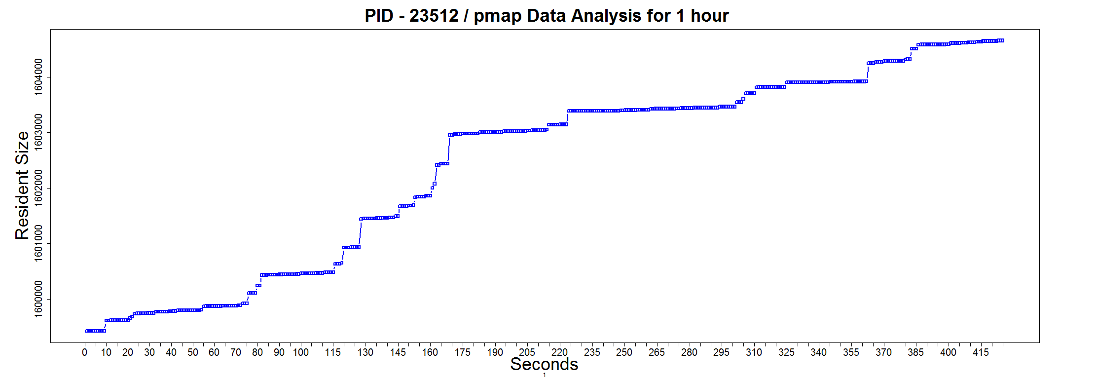
One of the linux administrators thought that the JVM is using all the memory in his linux server. So as a means of convincing him otherwise I plotted the ‘RSS’ column from ‘pmap’ output as a time series graph.
this.dir <- dirname(parent.frame(2)$ofile)
setwd(this.dir)


data = read.table("D:\\Log analysis\\pmapdata-node1.15979",header=F)
colnames(data) <- c("Kbytes","RSS","Dirty Mode")
rNo<-as.integer(rownames(data))
data<-cbind(data,rNo)

png(
  "pmapanalysis15979RSS.png",
   width = 2224, height = 768)
par(mar=c(5, 7, 4, 8) + 0.1)

plot(data$rNo,data$RSS,pch=0,type="b",col="blue",axes=FALSE,  ylab="", xlab="",las=2,lwd=2.5)
title(" PID - 15979 / pmap Data Analysis for 1 hour",cex.main=3,xlab="Seconds", ylab="Resident Size", cex.lab=3,1)

axis(side=1, at=seq(0, max(data$rNo), by=5), cex.axis=1.7)
axis(side=2, at=seq(0, max(data$RSS), by=10000), cex.axis=1.7)


box()

dev.off()
Graph of Resident Size of the JVM