Parsing Java Micro-benchmarking Harness data using dplyr – Part 2
June 18, 2015 Leave a comment
I have to add explanations later because I have to determine if the statistical measures calculated are correct or wrong. But this is based on the previous blog post.
Update : I think the measures are correctly plotted.
Types of Error bars used to plot the diagram
| Error bars | Type | Description |
| Standard error (SEM) | Inferential | A measure of how variable the mean will be, if you repeat the whole study many times. |
| Confidence interval (CI), usually 95% CI | Inferential | A range of values you can be 95% confident contains the true mean. |
The parsing will not work if JMH changes the default format of the output file.
library(stringr)
library(dplyr)
library(ggplot2)
data <- read.table("D:\\jmh\\jmh.txt",sep="\t")
final <-data %>%
select(V1) %>%
filter(grepl("^Iteration", V1)) %>%
mutate(V1 = str_extract(V1, "\\d+\\.\\d*"))
final <- mutate(final,IDX = 1:n())
jc <- final %>%
filter(IDX < 21)
gc <- final %>%
filter(IDX > 20)
gc <- mutate(gc,IDX = 1:n())
jc <- data.frame(sapply(jc, function(x) as.numeric(as.character(x))))
gc <- data.frame(sapply(gc, function(x) as.numeric(as.character(x))))
print(summary(jc$V1))
error <- qt(0.995,df=length(jc$V1)-1)*sd(jc$V1)/sqrt(length(jc$V1))
error1 <- mean(jc$V1)-error
error2 <- mean(jc$V1)+error
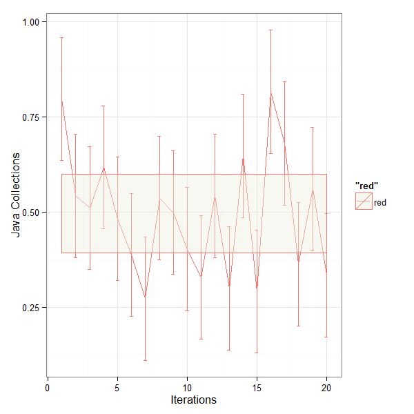
q <- qplot(geom = "line",jc$IDX,jc$V1, colour='red')+geom_errorbar(aes(x=jc$IDX, ymin=jc$V1-sd(jc$V1), ymax=jc$V1+sd(jc$V1)), width=0.25)+
geom_ribbon(aes(x=jc$IDX, y=jc$V1, ymin=error1, ymax=error2),fill="ivory2",alpha = 0.4)+
xlab('Iterations') + ylab("Java Collections")+theme_bw()
ggsave("D:\\jmh\\jc.png", width=6, height=6, dpi=100)
#Using error <- qt(0.995,df=length(jc$V1)-1)*sd(jc$V1)/sqrt(length(jc$V1))
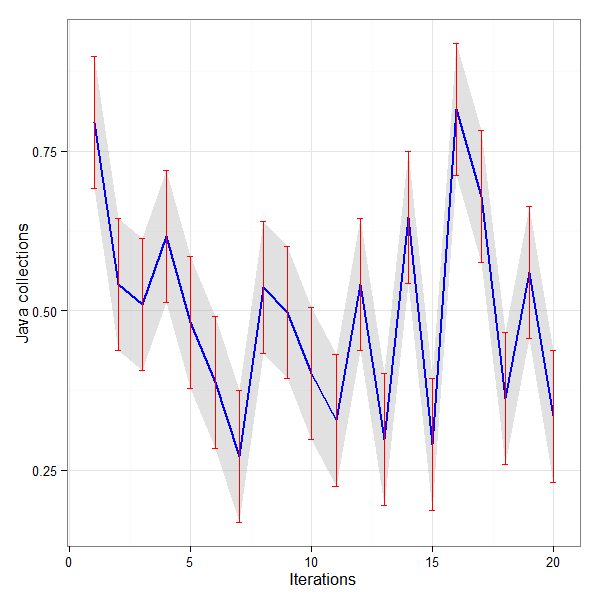
g <- ggplot(jc, aes(x = IDX, y = V1)) +
theme_bw() +
geom_ribbon(aes(ymin = V1 - error, ymax = V1 + error), fill = "gray60",
alpha = 0.3) +
geom_line(color = "blue", size = 1) +
geom_errorbar(aes(ymin = V1 - error, ymax = V1 + error), width = 0.25,
color = "red") +
labs(x = "Iterations", y = "Java collections")
ggsave("D:\\jmh\\ggplotjc.png", width=6, height=6, dpi=100)
print(summary(gc$V1))
error <- qt(0.995,df=length(gc$V1)-1)*sd(gc$V1)/sqrt(length(gc$V1))
error1 <- mean(gc$V1)-error
error2 <- mean(gc$V1)+error
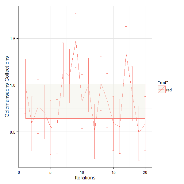
q1 <- qplot(geom = "line",gc$IDX,gc$V1, colour='red')+geom_errorbar(aes(x=gc$IDX, ymin=gc$V1-sd(gc$V1), ymax=gc$V1+sd(gc$V1)), width=0.25)+
geom_ribbon(aes(x=gc$IDX, y=gc$V1, ymin=error1, ymax=error2),fill="ivory2",alpha = 0.4)+
xlab('Iterations') + ylab("Goldmansachs Collections")+theme_bw()
ggsave("D:\\jmh\\gc.png", width=6, height=6, dpi=100)
#Using error <- qt(0.995,df=length(gc$V1)-1)*sd(gc$V1)/sqrt(length(gc$V1))
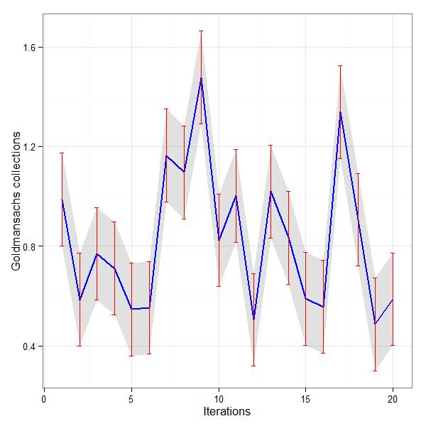
g1 <- ggplot(gc, aes(x = IDX, y = V1)) +
theme_bw() +
geom_ribbon(aes(ymin = V1 - error, ymax = V1 + error), fill = "gray60",
alpha = 0.3) +
geom_line(color = "blue", size = 1) +
geom_errorbar(aes(ymin = V1 - error, ymax = V1 + error), width = 0.25,
color = "red") +
labs(x = "Iterations", y = "Goldmansachs collections")
ggsave("D:\\jmh\\ggplotgc.png", width=6, height=6, dpi=100)
Suggested by the R user forum to improve the aesthetics of the plot. The Confidence Interval of 99% shown in the plots above is not correct. But the curves and error bars are correct.
g1 <- ggplot(gc, aes(x = IDX, y = V1)) +
		theme_bw() +
		geom_ribbon(aes(ymin = V1 - error, ymax = V1 + error), fill = "gray60",
				alpha = 0.3) +
		geom_line(color = "blue", size = 1) +
		geom_errorbar(aes(ymin = V1 - error, ymax = V1 + error), width = 0.25,
				color = "red") +
		labs(x = "Iterations", y = "Goldmansachs collections")
ggplot creates these two graphs. So instead of qplot code we should use ggplot.
Update : See this
