matplotlib
January 4, 2014 Leave a comment
![]()
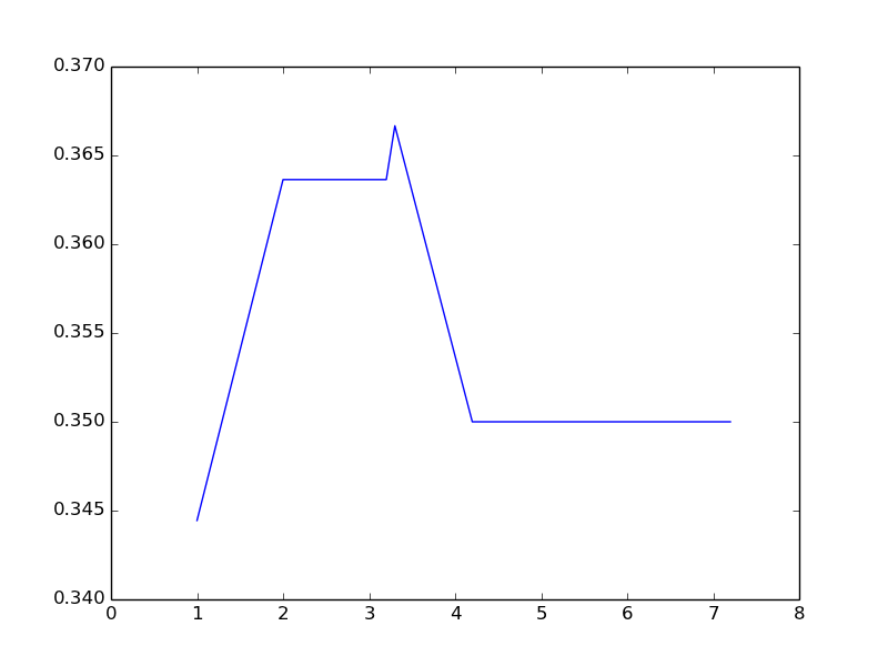
I wanted to generate the boxplot graphs in this DZone article using ‘R’. I think this is one of the best graphs I have seen. It shows data in a really useful manner that could help our Capacity Planners. I am quite proficient with basic ‘R’ data analysis and plots.
So I started to look at matplotlib,a powerful Python plotting library. So as a first step I coded this Python program using matplotlib.
- I am using PyDev plugin for eclipse.
- I am also using Enthought Canopy as by Python interpreter. This package has all the libraries I need.
I strugged for some time to configure the Python packages so that Pydev can use them properly instead of the default Python in my Mac machine.
All is well in the end. I have coded Python in the past but my skills are rudimentary but still this code was simple. It has many similarities to ‘R’.
'''
Sample
'''
import numpy as np
import matplotlib
import matplotlib.pyplot as plt

x = []
y = []

data = [[ 6.2, 18, 0.3444444  ],
        [ 1.0,  11, 0.3636364 ],
        [ 2.0,  11, 0.3636364 ],
        [ 3.3,  9, 0.3666667  ],
        [ 4.2,  12, 0.3500000 ],
        [ 3.2,  12, 0.3500000 ],
        [ 5.2,  12, 0.3500000 ],
        [ 6.3,  12, 0.3500000 ],
        [ 7.2,  12, 0.3500000]]

for list in data:
    for number in list[:1]:
        x.append(number)

for list in data:
    for number in list[2:3]:
        y.append(number)

x.sort()

print(x)
print(y)

plt.xlim( (0, 8) )

plt.plot(x,y)

plt.show()