Performance engineering – Simple Bottleneck analysis
August 8, 2012 Leave a comment
I believe the software developers and leads have forgotten the fundamental concepts of Statistics and other indispensable foundational derivations and formulae. One of the key reasons for this is succinctly explained by Cary V. Millsap from Oracle Corporation in his paper “Performance Management : Myths and Facts”.
“The biggest obstacle to accurate capacity planning is actually the difficulty in obtaining usable workload forecasts. Ironically, the difficulty here doesn’t stem from a lack of mathematical sophistication at all, but rather from the inability or unwillingness of a business to commit to a program of performance management that includes testing, workload management, and the collection and analysis of data describing how a system is being used. “
I am learning the ropes here but one field that is very helpful for performance engineering is queuing theory and analysis and the following is a collection of details from various papers. There is also a rather feeble attempt by me to use PDQ for solving a simple queuing problem.
Fundamentals :
T–the length of the observation period;
A–the number of arrivals occurring during
the observation period;
B–the total amount of time during which the system is busy during the observation period (B ≤ T); and
C–the number of completions occurring during the observation period.
Four important derived quantities are
λ = A/T, the arrival rate (jobs/second);
X = C/T, the output rate (jobs/second);
U = B/T, the utilization (fraction of time system is busy); and
S = B/C, the mean service time per completed job.
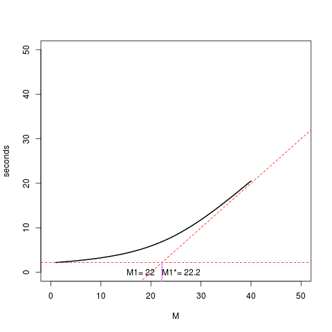
My feeble attempt to solve a particular problem. The resulting graph seems erroneous at this time but I will try to fix it.
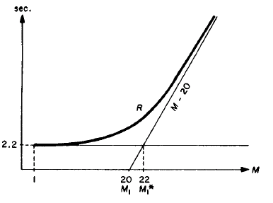
Problem statement from pages 241-242 in “The Operational Analysis of Queueing Network Models* by PETER J. DENNING and JEFFREY P. BUZEN (Computing Surveys, Vol. 10, No. 3, September 1978)
using pdq and get the graph
based on the system diagram
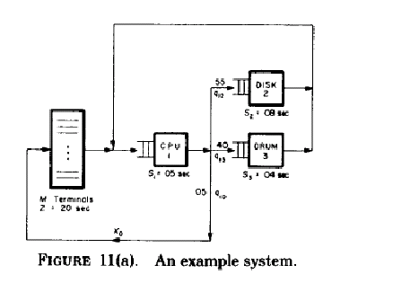
The diagram is smudged. The think time, Z is 20 seconds and S1 = 05 seconds, S2 = 08 seconds and S3 = 04 seconds.
The visit ratios( mean number of requests per job for a device ) shown in the diagram and given in the paper are
V0 = 1 = .05V1
Vl = V0 + V2 + V3
v2 = .55V1
V3 = .40V1
Solving these equations we get these values. The paper shows the result but it is trivial to substitute and derive the results. So I have done that.
v1 = .05(v2/.55) + .55(v2/.55) + .40(v2/.55)
v1 = v2/.55
v1 = ( v2 * 100 ) /55
55v1 = 100v2
11v1 = 20 v2
v1/ v2 = 20/11
v3 = v1 – v0 – v2
v3 = .40 * 20 v2 / 11
11v3 = 8v2
v2/v3 = 8/11
V1 * S1 = (20)(.05) = 1.00 seconds (Total CPU time is the bottleneck )
V2 * S2 = (11)(.08) = .88 seconds (Total Disk time)
V3 * S3 = (8)(.04)= .32 seconds (Total Drum time)
These products sum to the minimal response time of 2.2 seconds
V1 * S1 = (20)(.05) = 1.00 seconds (Total CPU time is the bottleneck )
V2 * S2 = (11)(.08) = .88 seconds (Total Disk time)
V3 * S3 = (8)(.04)= .32 seconds (Total Drum time)
These products sum to the minimal response time of 2.2 seconds
The number of terminals required to begin saturating the entire system is
Ml* = 22.2
My feeble attempt to use PDQ based on many resources.
# Bottleneck analysis .

library(pdq)

# PDQ globals
load<-40
think<-20

cpu<-"cpunode"
disk<-"disknode"
drum<-"drumnode"

cpustime<-1.00
diskstime<-.88
drumstime<-.32
dstime<-15

workload<-"workload"

# R plot vectors
xc<-0
yc<-0

for (n in 1:load) {
	Init("")

	CreateClosed(workload, TERM, as.double(n), think)

	CreateNode(cpu, CEN, FCFS)
        #SetVisits(cpu, workload, 20.0, cpustime)
	SetDemand(cpu, workload, cpustime)


	CreateNode(disk, CEN, FCFS)
	SetDemand(disk, workload, diskstime)

	CreateNode(drum, CEN, FCFS)
	SetDemand(drum, workload, drumstime)


	Solve(EXACT)

	xc[n]<-as.double(n)
	yc[n]<-GetResponse(TERM, workload)
}

M1<-GetLoadOpt(TERM, workload)

plot(xc, yc, type="l", ylim=c(0,50), xlim=c(0,50), lwd=2, xlab="M", ylab="seconds")
abline(a=-think, b=cpustime, lty="dashed",  col="red")
abline( 2.2, 0, lty="dashed",  col = "red")
text(18, par("usr")[3]+2, paste("M1=", as.numeric(M1)))

# This calculation is from the x and y values used to draw lines above
# y = -think + x
# 2.2 = -20 + x
x = 22.2
segments( x, par("usr")[3], x, 2.2, col="violet", lwd=2)
text(26, par("usr")[3]+2, paste("M1*=", x))
Points
1. I was trying to set the visits( mean number of requests per job for a device ) to get an exact graph. Initially I did not know how to do that. Point 2 below seems to be what I missed initially.
2. The graph I got seemed to be wrong because the value of M1 and M1* described in the paper and shown above are wrongly calculated. M1* is the straight line drawn from the intersection of the two dashed red lines to intersect the Y-axis.
2. The new graph is a result of the new service demands
cpustime<-1.00
diskstime<-.88
drumstime<-.32
each of which is set to the product of the visit time and service time. M1 and M1* seem to be close to the problem graph in the paper.
3. The additional point is that I might have made an error in the PDQ or R code that I have failed to detect. I am not still an expert. The asymptote intersects the y-axis before ’20’ but the value of M1 is 22. That looks like an error which I will try to figure out.