Visualizing algorithm growth rates
November 20, 2012 Leave a comment
I have been singing paeans about ‘R’, the statistics language, in this blog because it helps one understand and code statistical programs which are the key to various calculations in the fields of project management and capacity planning.
I have also been mulling about how I can generate graphs of algorithm growth rates when input sizes vary. This is child’s play when we use ‘R’.
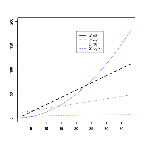
I could reproduce the graph from Jones and Bartlett’s ‘Analysis of Algorithms’ quite easily. Visualizing these growth rates easily like this is helpful.
The code is general. Nothing specific to algorithm analysis. Immensely useful.
png("funcgrowth.png")
curve(x*x/8,xlab="",ylab="",col="blue",ylim=c(0,200),xlim=c(2,38))
par(new=TRUE)
curve(3*x-2,lwd=3,ylim=c(0,200),xlab="",ylab="",xlim=c(2,38),lty="dashed")
par(new=TRUE)
curve(x+10,lty="dashed",lwd=1,ylim=c(0,200),xlab="",ylab="",xlim=c(2,38))
par(new=TRUE)
curve(2*log(x),col="blue",lty="dashed",lwd=1,ylim=c(0,200),xlab="",ylab="",xlim=c(2,38))
legend(20,180, c("x*x/8","3*x-2","x+10","2*log(x)"), lty=c(1,2,2,2), lwd=c(2.5,2.5,1,1),col=c("blue","black","black","blue"))
dev.off()
